
I was asked to rebrand the AIUM Annual Meeting and come up with a new concept for how this international gathering would communicate its mission of being the destination for experiencing ultrasound excellence and community. Some challenges I faced initially were understanding the current audience’s views on the meeting experience, finding a way to convey to the current audience that this is a sub-brand of the AIUM, and including imagery that would convey truths that the current audience already associated with the AIUM brand.
I began my research by reviewing notes I took while speaking with meeting attendees from prior years and looking for similar phrases and/or keywords. What I found in those conversations was a repeating theme that this event was where most people found their community. I used this statement as the key thread for any visual directions moving forward as it helped to address all three initial challenges.
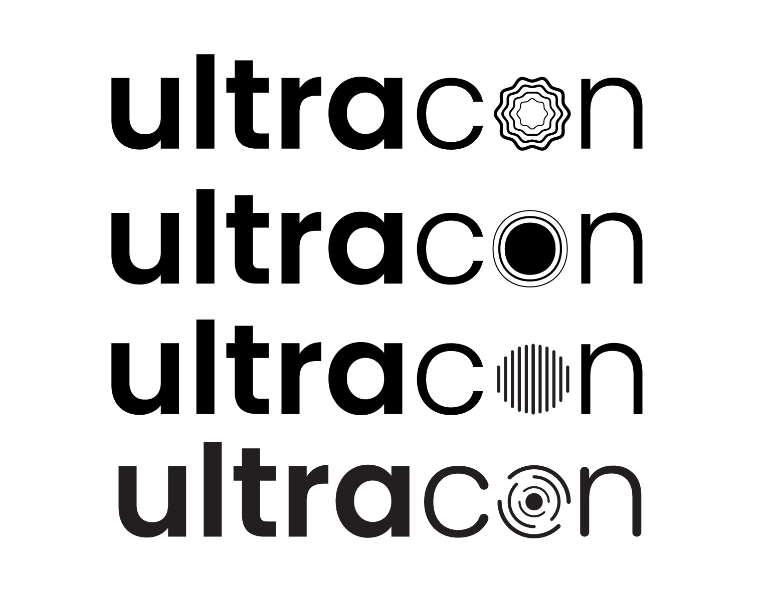
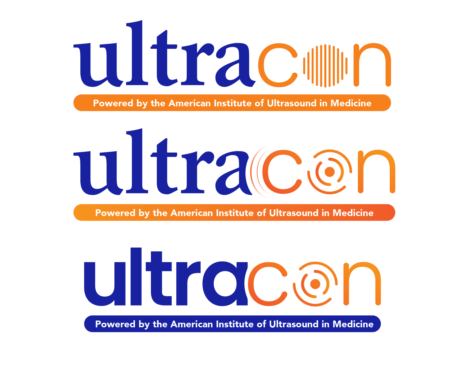
Through multiple iterations of the design process, I explored using the AIUM supporting color palette along with simplified typefaces to stand out from current brand elements. I then explored how to incorporate imagery into the type to add visual interest.
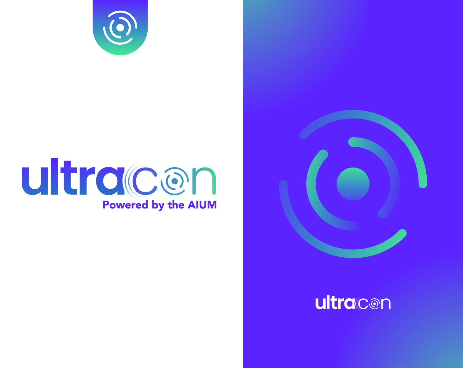
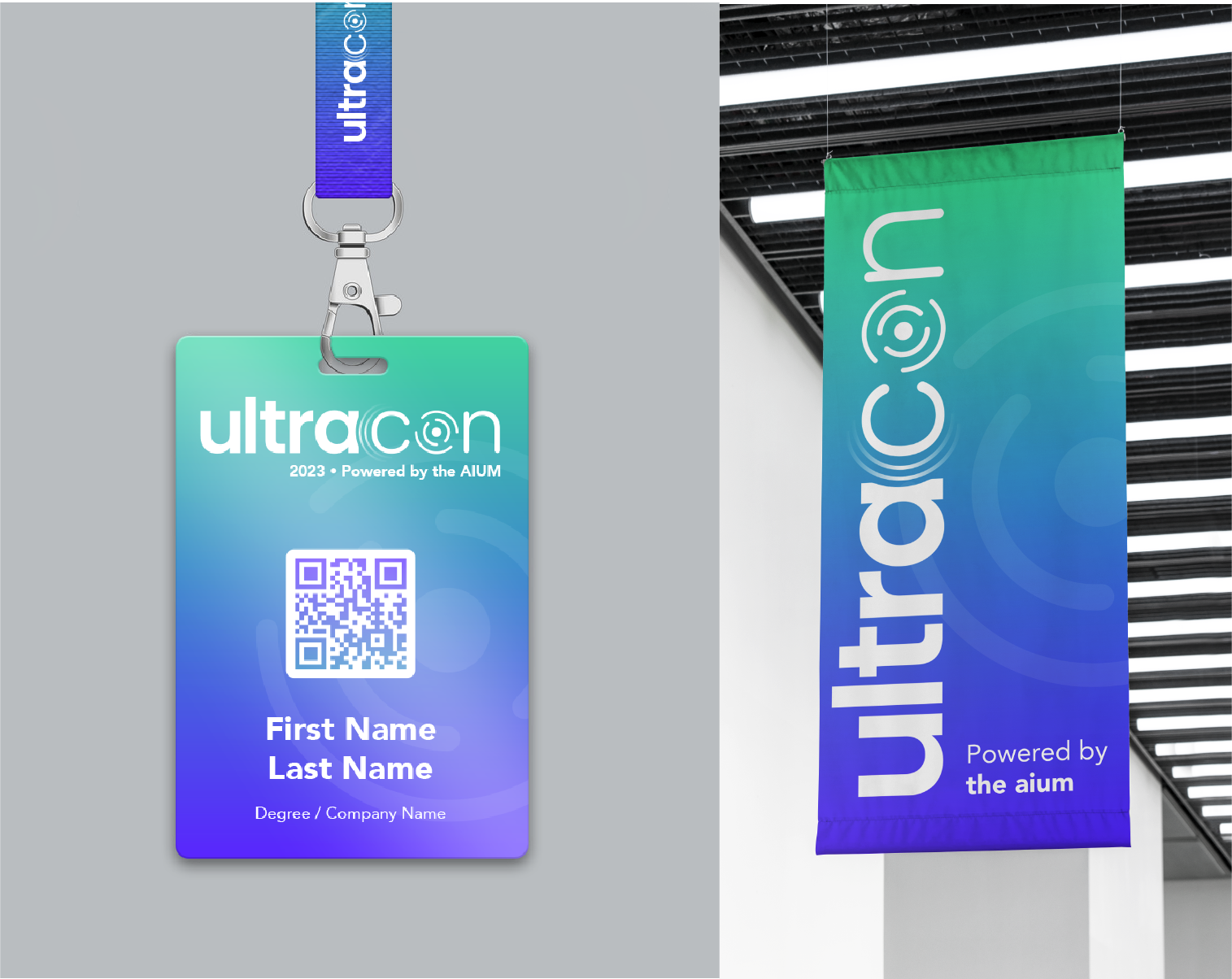
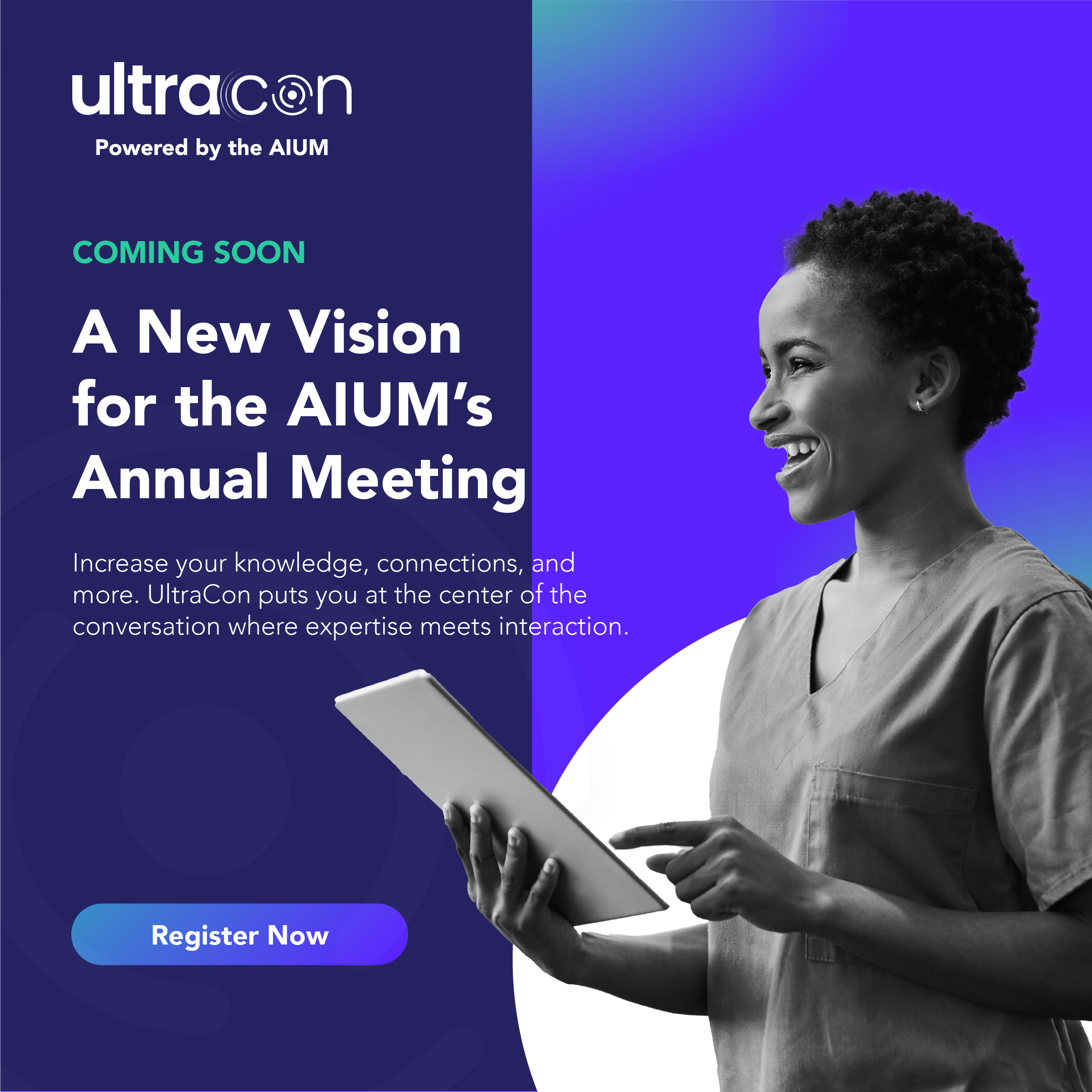
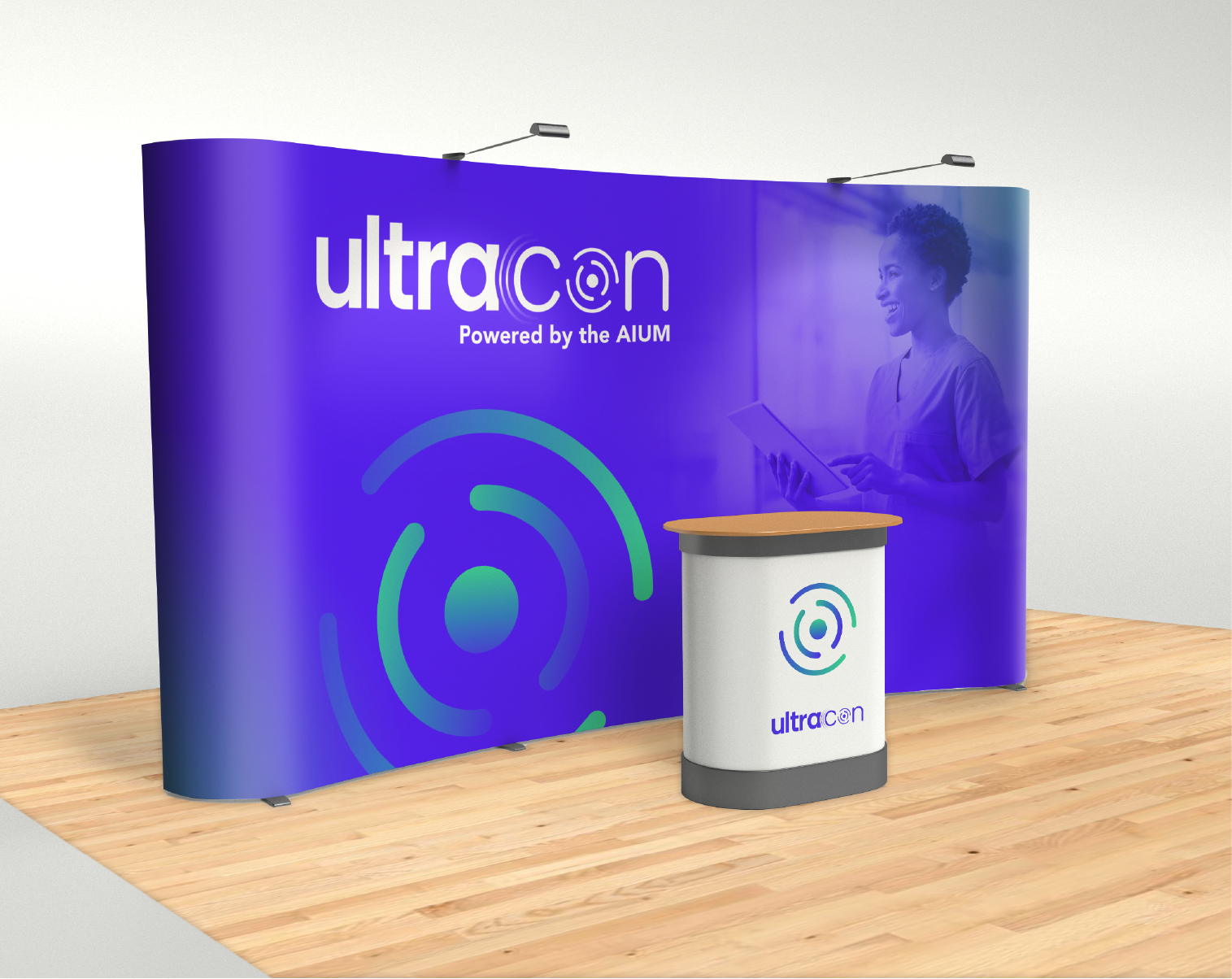
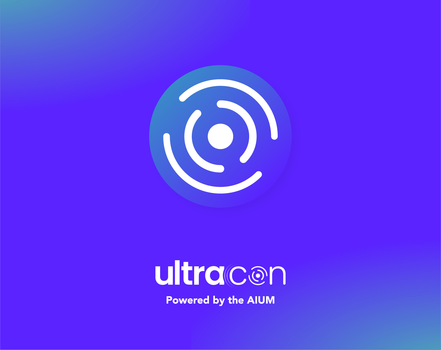
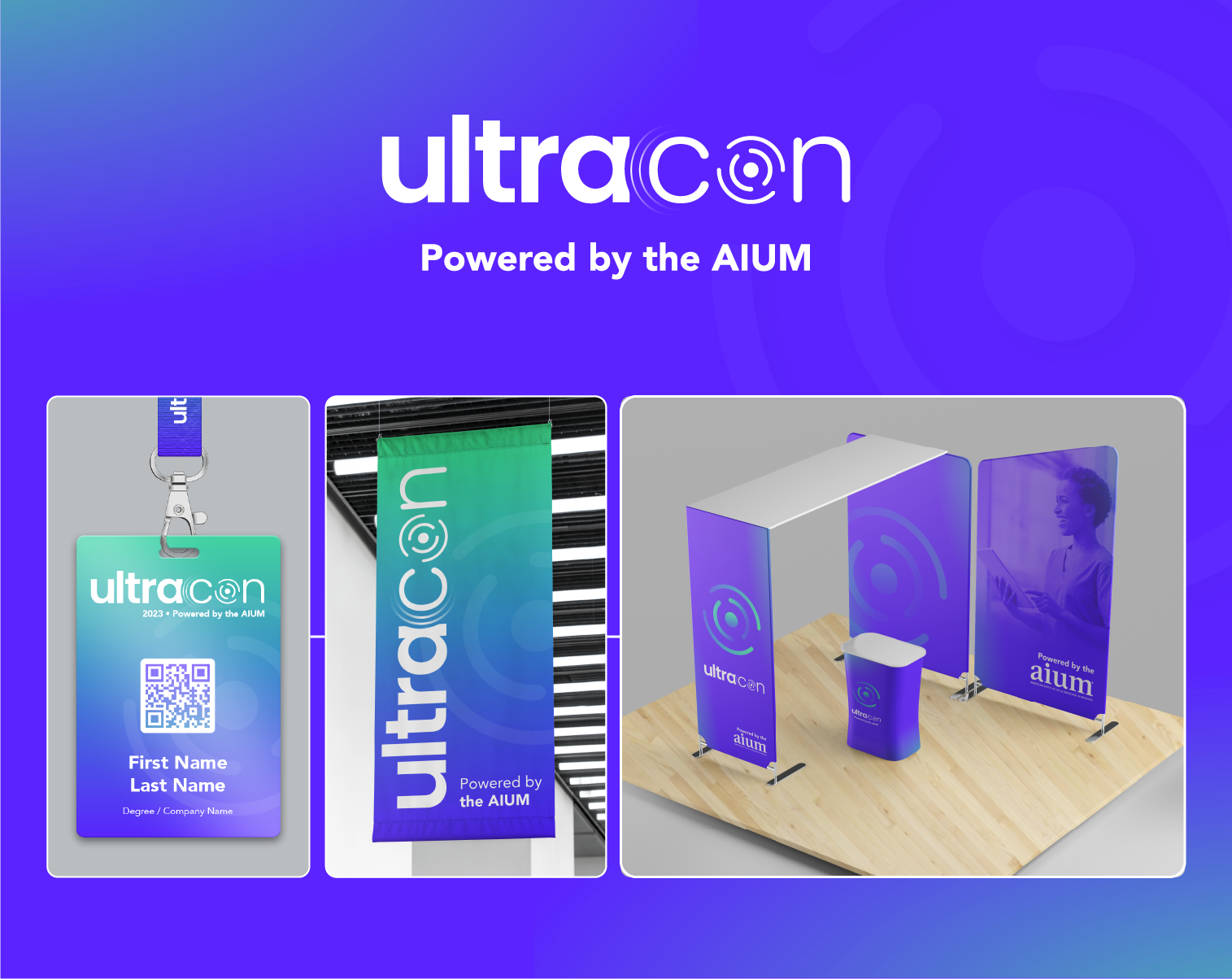
My final solution is "UltraCon" a new vision for the AIUM Annual Meeting. It solves two of my original challenges by utilizing waveform imagery to convey the sense of the individual’s part of the growing community. The tagline, "Powered by the AIUM" was added and the AIUM's secondary color palette was used to remind the audience that this is a sub-brand of AIUM and not a separate entity.